
Metrics
In Librato, a Metric is the variable you’re measuring. This might be little bit different from other systems you may be familiar with, where a metric is the combination of a variable you’re measuring, combined with the instance you are taking the measurement from.
If, for example, you’re measuring CPU Load on Server1, Server2, and Server3, you might expect each measurement to be a different Metric Our system however, separates the source (in this case servers 1, 2 and 3) from the Metric (In this case CPU). This is really handy, because it means you don’t have to individually plot each source to make a Chart; rather, you simply plot the CPU Load Metric and each source reporting that metric will automatically appear in the chart for you. If you have too many sources, you can easily use keywords to filter down the sources depicted in a chart.
Lets take a look at how this works in practice. The drop-down menu in the upper left corner of the spaces interface contains an option to show us all of our metrics.

The metrics viewer presents a list of all metrics. You can filter this down by entering a typeglob, or even a few key-words into the filter field. Following my CPU Load example above, I’ve typed in the keywords ‘collectd’ and ‘load’. This returns four metrics, and from this shortened list, I select collectd.load.shortterm, which is the short-term load metric as measured by collectd.

190 different Sources are emitting the collectd.load.shortterm Metric. The viewer displays a graph containing the first 25 sources. In this case, each source is a distinct server, so each source name is a server name. I can page through my servers by hitting the Next and Previous buttons, or I can enter another filter to depict just the sources that match the filter. I type in the keyword ‘kafka’ to filter out everything but the Kafka servers.

Filtering sources in a chart like this is powerful, and we use it throughout our interface. In fact, when you’re creating a new chart you can hard-code the sources it depicts, or select Dynamic which enables you to use a single filter to select the sources depicted by every chart in a Space at the same time.
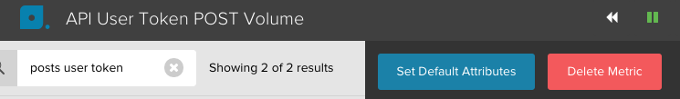
Lets look at another Metric from a different kind of source. By typing the keywords: posts user token I’ve found a Metric called api.measures.posts.user-tokens.vol.total. We use this metric to track the volume of posts per user-id that our customers are making to our API. In this screenshot, you’ll notice that my sources are not server names, but rather user tokens.

Now we can filter on the source dimension to isolate particular customers or groups of customers. As you can see the source dimension can really refer to any sort of data that you might want to isolate later.
Mass Edit / Delete Metrics
If you want to edit the attributes of a group of metrics or delete them, you can search them by typing search patterns into the search bar and then checking the check box right underneath it. That will select all the metrics found in the search and unveil two buttons: the “Set Default Attributes” and the “Delete Selected Metrics” buttons:
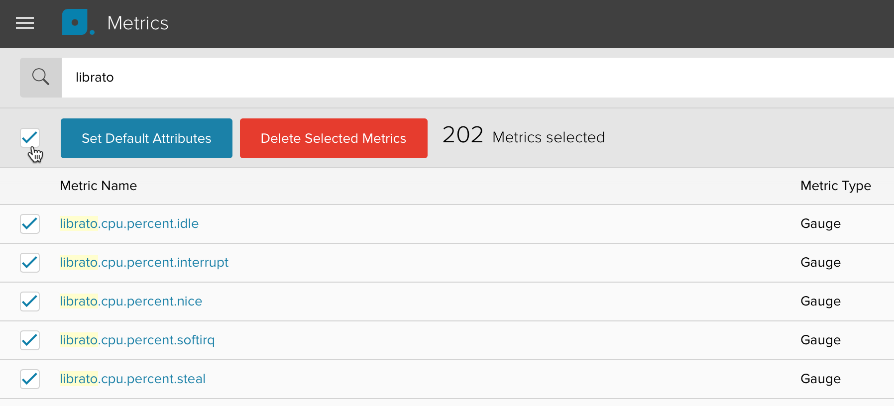
Any changes you make will be applied to all the metrics you selected.
Default Attributes
Metric attributes are used to configure default settings on the metric itself, all of which may be overridden by the stream attributes which you can set after adding the metric to a chart.
Click on the Set Default Attributes to bring up the configuration dialog.

The following attributes can be configured:
- Label: Metric name displayed by the tooltip.
- Color: Set the color of your metric either via hex code or the color picker.
- Units: Units label displayed by the tooltip.
- Transform (gauges only): Apply a simple formula to the data to, for example, convert between units like Fahrenheit to Celsius ((x-32)/1.8), or compute rates (x/p). Permitted variables are x (data point) and p (period).
- Metric reports every: Interval at which you are sending us data (otherwise knows as the period). We use this setting along with the Reports Infrequently setting to properly handle gap-detection for your data. If the period is set, gaps will show for periods where no data is received. If it is not set, data points will be connected.
- Reports Infrequently: Some metrics are reported opportunistically i.e. every n seconds a measurement is sent only if there is new data. This results in a sparsely populated series. We use this setting in combination with the Period to correctly handle Gap-Detection.